Mastering effective website design brings together the perfect blend of visual appeal and practicality. These websites go beyond making a simple statement – they convert casual visitors into devoted customers. Research consistently highlights the profound impact design wields over sales and business expansion, providing a notable edge for those who recognize its immense potential.
In the world of contractors, the marriage of style and utility forms the cornerstone. Style delivers eye-catching aesthetics, while functionality propels casual browsers toward becoming active clients.
Amid the crowded landscape, your website’s design emerges as a linchpin. It’s the deciding factor when services align, with a polished design unlocking the doorway to capturing and retaining potential clients.
Our compilation of the top 50 contractor websites presents an array of diverse designs, showcasing the dynamic possibilities within this field.
An unwavering online presence stands indispensable, as websites lay the foundation for that critical first impression. Rankings hinge on a medley of aesthetics, functionality, distinctiveness, and user experience.
Embark on a journey to master the art of crafting a triumphant website, delving into examples ranging from general contractors to specialized home services. For a broader perspective, don’t miss our comprehensive blog article highlighting the Overall Best Websites!
The Top Contractor Website Designs
- 1. VKB Homes
- 2. United Elite Group
- 3. Siena Construction
- 4. IL General Construction Services
- 5. Advanced Builders and Contractors
- 6. Eden Builders
- 7. B & B Basement Repairs
- 8. Texas Highlands Custom Homes
- 9. Affordable Contracting Services
- 10. Texan Home Additions
- 11. Brothers Concrete Construction LLC
- 12. OasisBuilders Inc
- 13. Goldenline
- 14. AP Remodeling
- 15. FVR
- 16. Desert Valley Contracting
- 17. Bartlett Cocke
- 18. JOERIS
- 19. IOC
- 20. Crawlspace Kings
- 21. DPR
- 22. 1 Home Construction
- 23. Model Remodel
- 24. Dyna
- 25. BNBuilders
- 26. CB Construction
- 27. Crescent Builds
- 28. Pacific West
- 29. Maybuilt Homes
- 30. Pathway Design
- 31. Merlin Custom Home Builders
- 32. J&E Modern
- 33. Blythe Custom Homes
- 34. Monumental
- 35. Hannegan
- 36. McCullough
- 37. JL General
- 38. Daniels
- 39. Bachmann
- 40. Birch Home Builders
- 41. MAYA
- 42. Another Kind
- 43. 123 Remodeling
- 44. HD Builders
- 45. Summit Design+ Build
- 46. Jost Homes
- 47. Staalsen
- 48. 3F Construction
- 49. Pryor
- 50. Chi Renovation and Design
1. VKB Homes

This is a very modern looking template that uses dark red, white, and black. Using small icons and graphics throughout the page was something that we liked. Additionally, this font was legible and their logo font was classy. A mainly dark background allows for a more luxurious feel for their company.
2. United Elite Group

United Elite Group offers a number of links throughout the website making it very easy to navigate the WordPress website. Very simple layout so the viewers can focus on the featured pictures, Under the main picture there’s a message about how they got started and taking pride in making new and returning clients happy. Also showcasing reviews about past customers’ experiences and what kind of service they got from the team.
Related: Start digital marketing for your construction company to take control of your online reputation, social media, conversion funnels, and lead generation.
3. Siena Construction

When excelling in various domains, it’s essential to showcase those talents. This website not only explains the diverse services they provide but also offers a captivating visual presentation of each service through expertly crafted website design. This fusion of information and aesthetics provides visitors with a comprehensive understanding of the extent of their capabilities. Furthermore, the website adeptly exhibits their previous projects via an engaging gallery of images, accompanied by insightful blogs detailing various remodeling endeavors. These meticulously written blogs intricately describe the transformations undertaken and the rationale behind them, assuring visitors of the company’s dedicated approach to each project.
4. IL General Construction Services

One of the first things that we noticed was their rounded image frames – although it is a small feature, it creates a more finished look. Allowing visitors to fill out a short form to request a free consultation was a nice addition. Showing off communities they serve was helpful for those wishing to use their services.
5. Advanced Builders and Contractors

This site is big and busy and offers a lot. The website has a lot of information on it so it’s good that it’s organized into different areas making it less overwhelming to the reader. One thing that I really like is that they have a link to video testimonials on their page. Reviews from happy customers showing the work that was done, along with some before and after’s. Visitors are able to get a visual of what they could have and have trust with the business.
6. Eden Builders

Eden Builders has a very simple website. The colors are navy and white, making things feel relaxed and at home. Easy to find contact information and contact form, making it easy to get ahold of them. Also, they offer homeowner tips through their email subscription.
Related: If you can’t find your construction website online, maybe think about improving your search engine optimization!
7. B & B Basement Repairs

We loved how this light blue accents the site professionally and simplistically. This company chose a unique logo design that stood out against their customers. Including FAQ section in their homepage was a smart choice that all customers would be excited for. A photo gallery also was a great choice because it allows people to see exactly what they should expect when hiring this company. Everything was well balanced and organized, which always improves a site like this one.
8. Texas Highlands Custom Homes
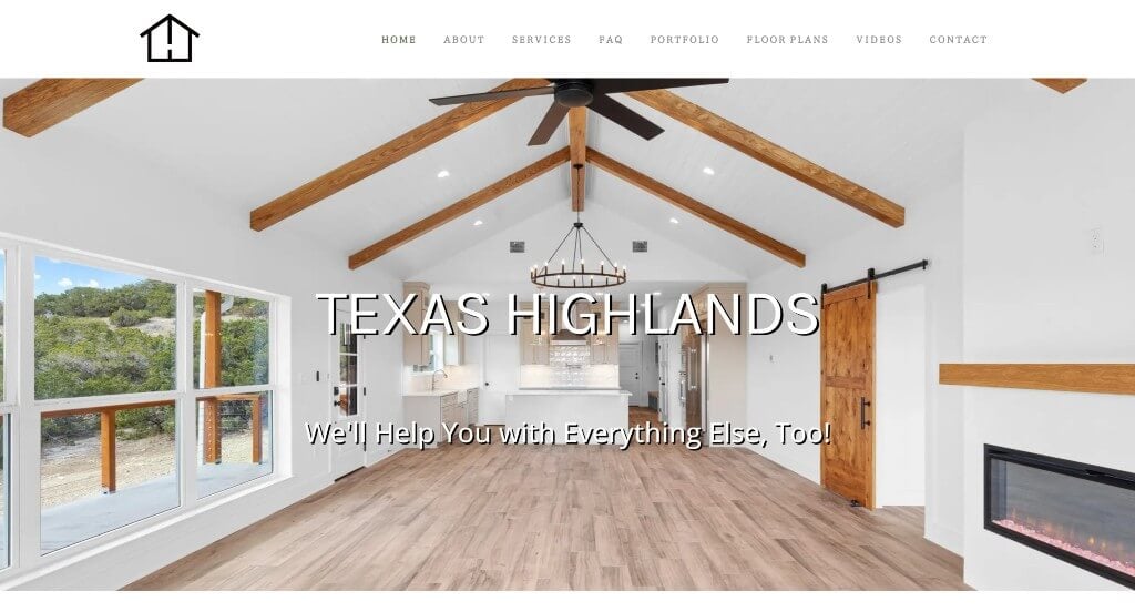
This clean template matches perfectly with their images. Everything is balanced allowing for a template that isn’t overwhelming. We really enjoyed their interesting fonts that made a more appealing visual. Their web domain also matched their company’s name, which was a smart choice.
9. Affordable Contracting Services

Enhanced by a vibrant website design, Affordable Contracting Services effectively conveys their core focus: delivering top-notch custom home builds and residential remodels. The structured 5-step process outlines the client journey with transparency. A dynamic color scheme adds to the visual appeal, while the judicious use of clear and engaging images enhances the overall aesthetic. The platform also stands out for its attention to convenience, as evidenced by the intuitive contact form that simplifies communication. This commitment to seamless engagement is further underscored by the presence of contact details in strategic locations across the website, cementing Affordable Contracting Services’ dedication to providing an accessible and visually pleasing experience.
10. Texan Home Additions

The color scheme used in this example was brilliant because it shows state pride. Additionally, these images are stunning so customers will want to reimagine their home looking like that. Short paragraphs are a great way to go for content because readers stay engaged for a longer amount of time if they are only reading the essentials. Including their awards and recognitions also helped them to build trust with their clients.
11. Brothers Concrete Construction LLC

The color scheme in Brothers Concrete Construction LLC is captivating in every way. Bullets were used to help organize information carefully and professionally. Adding in small graphics to help customers understand what each section is talking about was smart. You also might notice small, but bright red buttons that help customers navigate to a whole new area of their design. Testimonials can be found near the bottom, which was a great place for them. Out of the way, but not inaccessible. Make sure to take some time checking out this site.
12. OasisBuilders Inc

The creative designs throughout the contractor website showcasing services and other important information will keep the visitors interested. The color scheme brings the whole page together and makes the visitor comfortable. They also use testimonials from people to show that they do good work, these testimonials include pictures with one of the team members. This shows potential customers that you like to get to know your clients and not only want to just get the job done.
13. Goldenline

The website design adopts simplicity, featuring images of recent projects categorized by location. A video highlighting completed undertakings is also included. The page incorporates a convenient contact form that can be easily accessed and completed. Furthermore, a contact form immediately appears upon visiting the website, facilitating swift communication with the company. This approach demonstrates a commitment to engaging with visitors and addressing any inquiries they may have.
14. AP Remodeling

Capturing your focus, this web design highlights previous projects and provides a project-specific cost calculator. This enables visitors to obtain project estimates without initial business contact. Swift information delivery accelerates potential project initiation. Additionally, a live chat feature facilitates instant communication for visitors seeking immediate assistance.
15. FVR

The contracting site explains the services and what work could be done right away. Then they keep it simple by adding pictures of some of their projects. At the bottom of the page, you will find reviews from customers that scroll through. A live chat is also offered to get a reply immediately, so visitors know they will get a reply and don’t have to wait.
16. Desert Valley Contracting

Desert Valley Contracting, through an artful integration of website design, immediately elucidates the prospective client’s experience upon selecting their services. Their adept use of well-structured boxes elegantly organizes a wealth of information, making navigation through their offerings seamless and intuitive. Additionally, the website serves as a showcase, featuring an extensive array of their previous projects, each vividly captured and presented through thoughtful design. This not only instills confidence in potential customers but also assures them that by reaching out, they can expect results aligned with their aspirations, mirroring the quality showcased in the visually appealing project images.
Related: Consider a website marketing service for contractors if you need assistance with funnels, lead gen, or social marketing.
17. Bartlett Cocke

This page uses a bold color scheme and layout. The red and blue with the bold text make the site easy to remember. When visitors are looking at many websites it’s a good way for them to remember your site and then come back. The intro slider features a video that shows what kind of work they do, along with pictures throughout the page. They use many simple icons that you can click on, making it easy to move around the site.
18. JOERIS

The design of this contracting website is very clean and attractive. There is plenty of white space between the pictures, along with pops of blue that stand out. Everything is simple with not a lot of information on the main page but links that will bring you to more information. This makes the page nice and clean and helps the visitor not feel overwhelmed.
19. IOC

Inside Out Construction does an awesome job demonstrating what they do through pictures. The layout is simple but gets the point across. Also a personal letter along with a family picture on the “About Us” tab from the owner talking about how the business got started. Sharing personal stories is a great way to show you are dedicated to making customers happy.
20. Crawlspace Kings

Here is another stunning design due to their contrasting color scheme of purple and yellow. Small highlights of yellow are used to attract attention to graphics or short areas of text. All their written content is organized into perfected paragraphs, a smart choice for anyone struggling to build content. We also thought it was really smart to choose a domain name that matches their business name. Their navigation bar is built out professionally, allowing for easy access to their content.
21. DPR
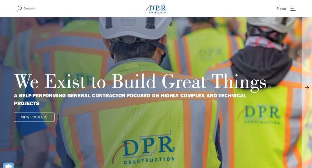
On the main page, this website uses a click-through slider for their information. At the end of the slider, they use links to showcase projects they can do, then go into more details once you click. This helps there not be too much information on the main page and not confuse the readers. They use links at the top of the page and divide them into four different categories to keep information organized.
Related: Rank higher in search results with contractor SEO services from an agency with experience.
22. 1 Home Construction

Right away, we were struck by this creative logo that hides their name within an icon. Bright red is used to highlight certain areas and information within their pages. We thought it was cool how many of their backgrounds had images or graphics used to have more interesting backdrops. Testimonials were added in, which is always helpful no matter your business.
23. Model Remodel

Through skillful website design, this platform offers easy information browsing. Its clean, appealing interface exudes a modern feel. The site also provides valuable remodeling advice at its bottom, empowering potential customers with insights into the process and costs. This background knowledge enables informed decision-making, enhancing the overall customer experience.
24. Dyna
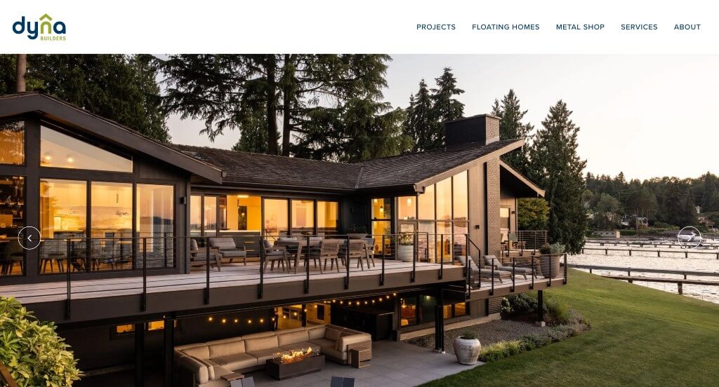
This website features a simple scroll-through option on the home page. Along with simple design and color making it easy to read. The page is very easy to navigate with different links at the top of the page. Also, it’s very easy to contact them by phone or email with having their contact information right at the top.
25. BNBuilders

This website starts by showing past projects and services that they offer. They use boxes and clear links to organize information. Making it very easy to find information right away. They also use large pictures to focus on their projects and where they are located. Also, they use a few different hoover options throughout the page making it easy for visitors to reach for more information.
26. CB Construction

CB construction is very clean and easy to follow. The layout is simple but gets the point across to potential customers. They use a feature that keeps their main page less cluttered, when you hover over an icon it will show you information for that area. This is a great way to get information to visitors by not overwhelm them with a lot of information at one time.
Related: Improve your paid advertising campaigns by hiring an agency specializing in contractor PPC management.
27. Crescent Builds

This site builds trust by highlighting the team’s dedication to ensuring your satisfaction with their work. Their site is very simple with plenty of white space. With contact information at the top and bottom of the main page. They introduce their team and even include their dogs, which are important to them. Also, they ensure that those things are build to last and point out their dedication to the environment.
28. Pacific West

The page starts with a video, this is a good way to get engaged people right away. Also, this offers a large amount of information all in one place. This website separates the services they offer into different categories, like maintenance, single home, or multi-family. Organizing information like that helps so potential customers don’t have to search through all the services and quickly find what they want.
Related: Hyper focus your paid advertising to reduce wasted ad spend and drive quality leads to your construction business from search and social channels.
29. Maybuilt Homes

A variety of images, graphics, written content, and videos are used here which is beyond helpful because viewers can learn how they learn best. Having a semi-transparent filter over their hero image made an interesting look that allowed their color scheme to come together right away. We thought turning the U into a little house was a cute choice for their logo.
30. Pathway Design

The layout catches your eyes, but it’s easy to follow and understand. They do a good job of making the information easy to browse through. The blue and gray keep the site simple but are a good pop of color. They have a strong call to action making it easy to follow.
31. Merlin Custom Home Builders

This was one of our favorites for sure. Upon entering, you’ll notice how there is a large image that viewers would dream of living in. Showing how many years they have been an established company helps build trust with hesitant clients. Their navigation bar is well organized, making it easy to find whatever information you’re looking for.
32. J&E Modern

Employing an uncomplicated arrangement, this web design employs a blue color palette. Following the initial slider showcasing images, the site delves into comprehensive information about the company’s operations and areas of focus. This section also outlines their core values. This approach promptly provides prospective customers with a clear grasp of the website’s purpose and the services available.
33. Blythe Custom Homes

Images are one of Blythe Custom Homes’ best features. They get people excited about the possibilities for their home. Occasionally showing floor plan graphics in their background was a feature that we loved. Including a section of their portfolio right on this homepage made it easy to see what they as a business have done before.
34. Monumental

Highlighted by effective website design, the initial attention-grabber is their specialization in restoration rather than remodeling. Prominently featured on the main page, their focus on restoring properties post fire, storm, and water damage signifies a versatile approach to projects of various scales. Notably, the website also includes a section dedicated to insightful blogs discussing diverse remodels, outlining their advantages. This dynamic blend of content not only communicates their versatility but also establishes them as a knowledgeable resource, enhancing their appeal to potential clients seeking both guidance and skilled restoration services.
35. Hannegan

This example site makes it very clear how to communicate with people that visit the contractor page. At the top, middle, and bottom of the page, they talk about getting in touch. This shows that they want to hear from you. They build trust by saying that they have 20+ years of experience, also offering a warranty. They show a very attractive bathroom with a big tub and shower. Targeting people that are looking to renovate or build a new home.
36. McCullough

This example contractor website right away shows the projects that they offer. Keeping the site simple with pictures and a green color scheme. At the bottom of the page, they share testimonials from pleased customers to help potential customers. They do a good job of separating commercial and residential.
37. JL General

JL General uses a pop-up contact form, wanting the visitor to contact right away so they can help. This is a great way to get visitors to ask the questions they have before looking at your page. This example contractor website seems to do it all from remodeling, add-ons, issues with plumbing/electrical, and property maintenance. This site is trying to show visitors that they are here for you for any project you want. With having many services they separated their reviews by services making it easy to quickly find what you need.
38. Daniels

Many other companies show end results but this site shows you that the process is just as important. Starting with an intro video of the team working on projects. They use colors that match their trucks and machines, making the site look coordinated. There is a lot of information, but easy to navigate through it all.
39. Bachmann

This site right off the bat shares information and pictures about what they do. They highlight what they do and show their unique work. They go into explaining when the business got started and how many completed projects, this is building trust with potential customers.
40. Birch Home Builders

An automatically playing video is used right away so that people can see the possibilities with this brand. Large buttons were also beyond helpful to get viewers to different areas of their site instead of placing all their information on one page. A section to meet the team was something that we found enjoyable.
41. MAYA

The contractor website features a red, white, and blue color scheme. which makes the page attractive and it’s easy to read. They showcase kitchen, bathroom, and basement remodeling. They go into detail on how much remodel work they have done for each section. Giving potential customers the satisfaction of know that there has been plenty of projects done before. They also explain why some remodels are a good idea getting the viewer interested in the project.
42. Another Kind

The colors are simple with lots of white space, and large images to draw your focus to the work they are displaying. They do a very good job at letting their images and simplicity do the selling. This allows them to have a lot fewer distractions and get straight to the point which is showing off the beautiful homes they have created. The use of large imagery works very well in an industry that is driven by uniqueness and creative visual concepts. Overall PRB Architects does a great job at matching their website design theme to their industry.
43. 123 Remodeling

Very clean and easy-to-read contractor website design. Multiple links that allow visitors to get more information. The phone number, email, and address are right at the top making it easy to contact them and know their exact location. A free estimate is offered right at the top so the visitor can know what price they can expect for the service they want.
44. HD Builders

This is a very bold design. From fonts to clean cut images, it shows that they are reliable and top notch. Short paragraphs were a great choice in order to keep readers finding information that is important to them. Using buttons and reappearing graphics was another thing that we really liked about HD Builders.
45. Summit Design+ Build

This contractor website uses a red color scheme that makes it pop, also catching your eye. Summit explains their process in different steps, showing you how things get done. Making it easier for the potential customer to know what they can expect when picking this company. They organized their portfolio into locations, along with the type of builds. Very clear on how to get into contact with this company with contact info at the top and bottom of the page.
46. Jost Homes

Upon entering this example, we knew that it would be a more simplistic, earthy feel to their projects. Their white color scheme is used to maintain balance and a clean look. Images are of high-quality, but are also beautiful, which makes people more likely to say yes to Jost Homes. We also felt that this company did a nice job with their font choice.
47. Staalsen

This website begins by outlining their business objectives, demonstrating their commitment to quality work regardless of project scale. Their portfolio is prominently featured on the homepage, allowing visitors to access project specifics. Towards the page’s conclusion, they highlight well-known companies they have collaborated with in the past.
48. 3F Construction

The 3F Construction web design showcases exceptional organization, facilitating seamless navigation and swift access to desired information. The homepage boasts a clean layout accentuated by an appealing orange color palette. Prominently positioned at the top are their social media icons. Furthermore, they provide introductions to each team member, accompanied by comprehensive paragraphs detailing their backgrounds. This approach effectively fosters familiarity between visitors and the company’s dedicated team.
49. Pryor

Enhanced by thoughtful website design, this platform adeptly balances information with visual elements, resulting in a clean and spacious layout. The strategic incorporation of images provides breathing room, contributing to the overall sense of organization. Furthermore, the site showcases endorsements from satisfied customers, each clickable for a deeper insight. Complementing these features, a user-friendly contact form simplifies reaching out, while a conveniently provided map pinpoints their location for easy reference.
50. Chi Renovation and Design

The website starts by sharing happy client’s experiences to help others know about the business and hear how the clients feel about the work. They share very appealing pictures of remodels that they have done that make you want everything in the picture. They also share other testimonials at the bottom of the page along with the area that they work, making it easy to know if they will work with you.
WordPress Contractor Themes
You can find free themes at wordpress.org, or explore contractor-inspired templates at ThemeForest.
ReConstruction – Themeforest
$59

Gedung | Contractor & Building Construction – Themeforest
$59

Estand – Themeforest
$49

Tradesmen – Themeforest
$59

Wix Contractor Themes
You can find free and paid themes in their marketplace at wix.com, some of which are suitable for contractor websites.
FAQs about Web Development for Contractor Websites
Craft a website with user-centric design for smooth navigation and a professional look. Feature detailed services and clear contact options. Select a suitable platform and dependable hosting. Share expert content, projects, and SEO keywords. Add clear calls-to-action for engagement.
Yes, When creating the best website, focus on user-friendly design, clear services, and contact info. Opt for a fitting platform and strong hosting. Share expert content with strategic SEO keywords and engage visitors with clear calls-to-action.
Utilizing a template for a contractor website offers cost-effective solutions. Templates come with pre-designed layouts and user-friendly features, ensuring a professional look and easy customization. They often include responsive design, built-in features, and support. Templates can be optimized for search engines and come in various designs, allowing you to choose what suits you. However, customization is crucial to ensure uniqueness, as others might use the same design.